This is my Assignment 5.The proposed solution aims to provide a platform for full-time master's students who enjoy museums and exhibitions by providing information on all famous museums and the latest exhibitions in Hong Kong, including hours, addresses, contents, reviews, and tickets. In addition, a website membership system is set up to provide more benefits to users. This website can save time and effort for exhibition enthusiasts to find, collect and filter relevant information so that they can arrange their trips better and have a better visiting experience. Easy and efficient access to information about exhibitions and museums in Hong Kong, making reservations, and buying tickets are the main functional requirements to be verified. The following usability test and A/B tests were conducted to obtain validation feedback on users' evaluation of the website and their willingness to sign up as members. 1. Usability TestFive tasks were designed to test the ease of accessing exhibition or museum information and signing up for membership: (1) Where would you click to get information? (2) How would you get more details, and what details would you get? (3) Register and log in. (4) Make a reservation and buy a ticket for an exhibition. (5) View your reservation orders. Three post-test questions were designed to obtain evaluations and suggestions for improvement: (1) Please rate the whole process: 5 as very satisfied, 1 as very dissatisfied. (2) What do you think the site has done well? (3) What difficulties did you encounter in the process? How can the pages be improved? The results of the usability tests are shown below: |
  |
|
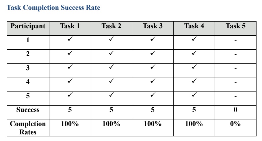
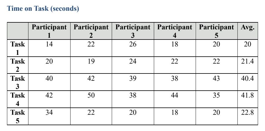
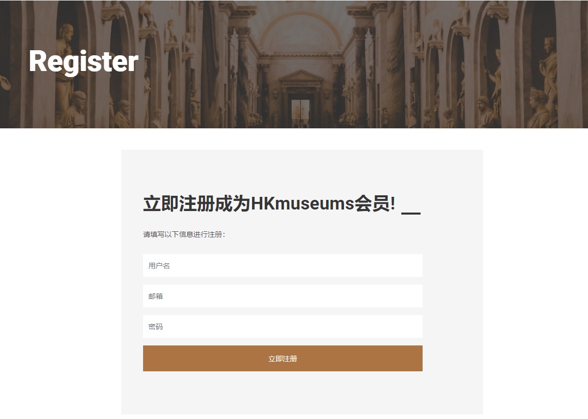
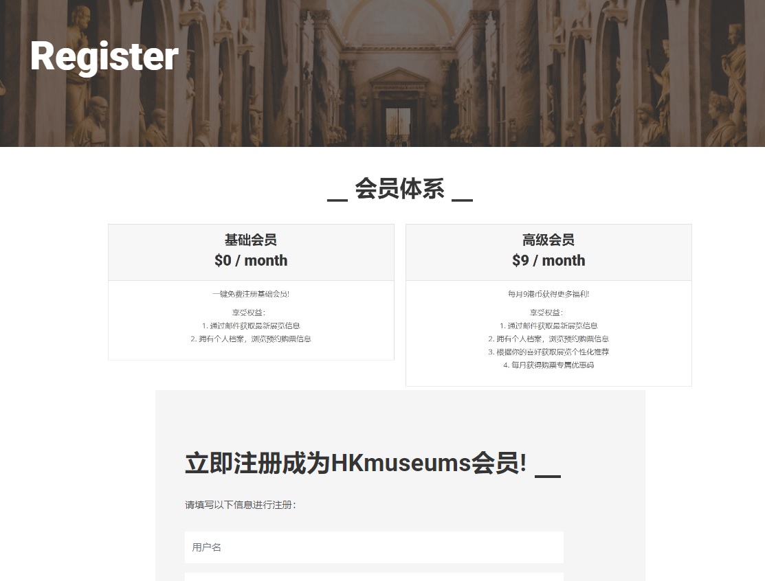
All participants successfully completed Task 1&2&3&4. No one was able to finish Task 5. As for time taken to complete tasks, tasks 1 and 2 were straightforward and easy for users to complete (mean = 20 and 21.4 seconds). Task 3 was designed for users to register and log in to become a platform member. Participants were asked to register and then log in, entering their information twice, so it took longer. (mean = 40.4 seconds). Task 4 asked users to select an exhibition of interest and make a reservation to buy tickets, which took the longest to complete (mean = 41.8 seconds). Most participants spent more time reading the information on the exhibition detail page. Task 5 asked users to find the reservation information, all participants can find it in a short time, but the login verification feature has not been added yet, and it should take participants longer. 2. A/B TestAn A/B test was conducted to test whether displaying membership details on the registration page would positively impact users registering intention of membership and submitting forms. In the original version, the registration page only had a lead-in message and a form to fill in personal information. In the variant version, membership details are added before the introductory statement, and users will see the membership settings first and then the form below. |
  |
|
As the A/B test is still in progress and there is a delay in the data, we can only see the first two days of data. Based on this incomplete result, users assigned with the Variant 1 version had slightly more page views and triggered events than those assigned with the original version, indicating that Variant 1 performed slightly better than the original version. |
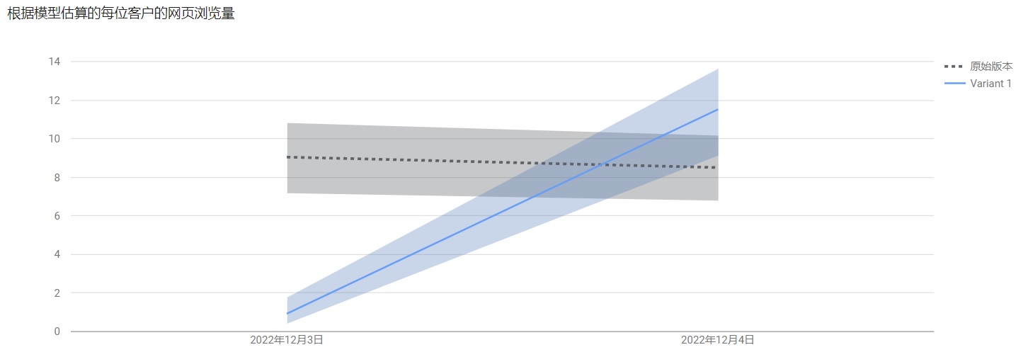 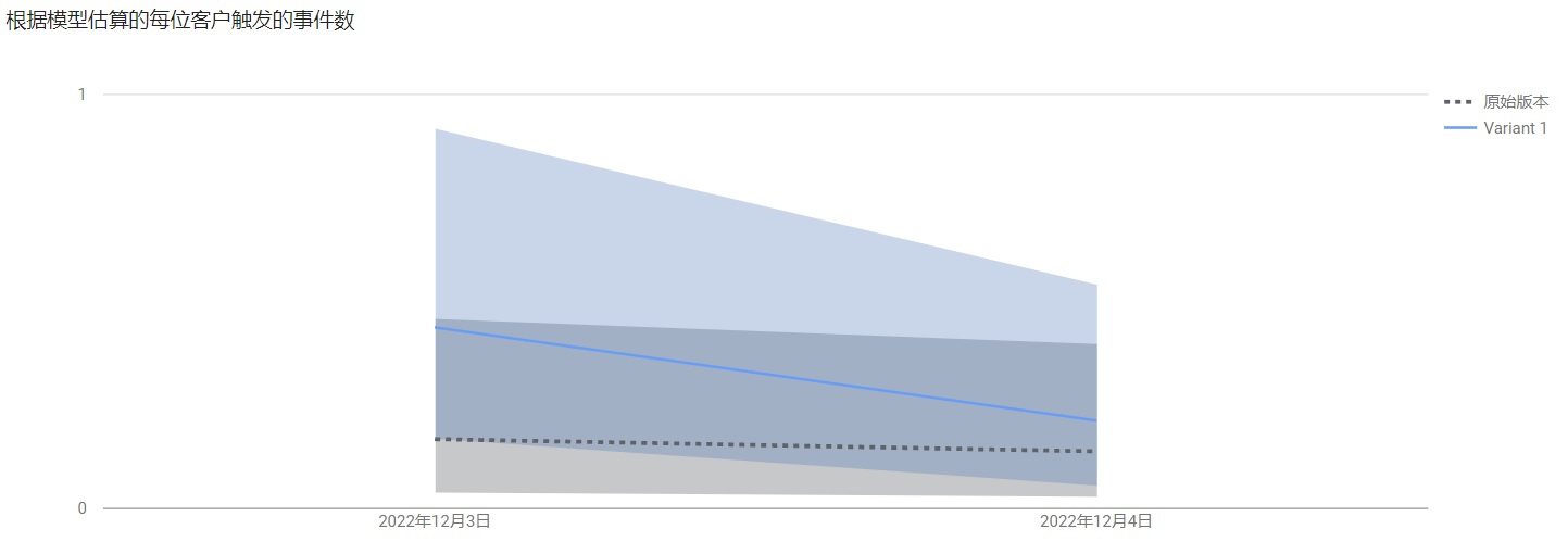 |
|
I will continue to collect data to confirm which one to choose as the final version. Suppose subsequent results continue this trend, combined with the results of the usability and A/B tests, the registration page will consider adding a description of the membership system. This will allow users to see and understand the membership details first and then decide whether to fill out the form below to register, thus increasing the time spent on the registration page and the probability of registration. |